


The widespread use of smartphones and tablets has made responsive website design mandatory for companies who wish to interact with their audiences via their online podium. If you are in the same boat, you must not exclude the idea of responsive website design.
But how to design a responsive website, or How will you know whether your website is responsive?
There are ways to measure this in a variety of ways. Hence, don’t fret! We are here to guide you.
What is responsive website design?
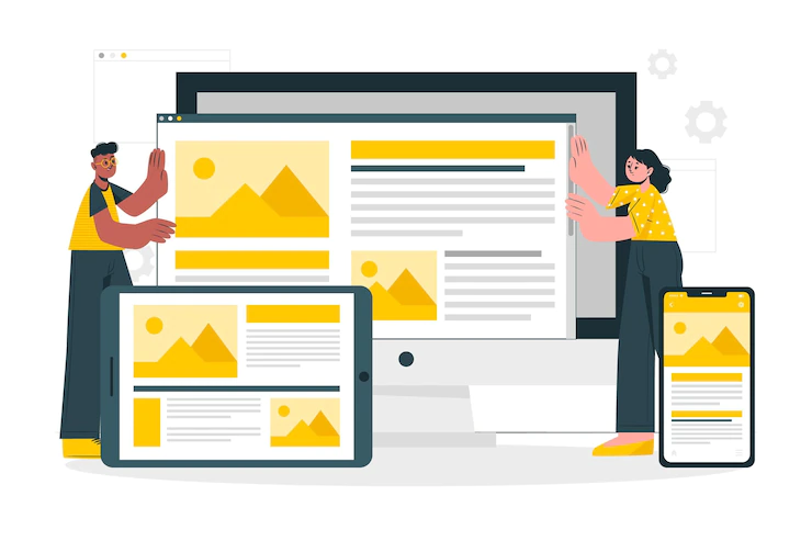
Responsive website design allows websites to display on any device easily. Additionally, such a web design approach enables sites to adapt easily to different screen sizes. Whether it’s a desktop computer, a smartphone, or another smart device, responsive web design is appropriate for all.
Key elements of responsive website design
Designing responsive websites is no longer just a trend, it’s a necessity. It is a must to incorporate all the essential elements of responsive design into your website.
What are the main elements that make a website responsive? Well, let’s check out.
- Coherence: A website’s bounce rate will increase with the inconsistent browsing experience. But with a responsive design, you Don’t have to worry about it.
A responsive design allows users to access data throughout the site easily. Hence, to bring consistency to your website, a company offering responsive web design services in India can help.
- Suitable for any device: A responsive design ensures your website is accessible from any smart device. The compatibility it offers makes a website looks great on any screen size.
- Easy Navigation: Your site must be easy to navigate for your users to have a positive experience. Easy navigation is one of the key characteristics of responsive web design.
Furthermore, with easy navigation, visitors are sure to find what they need. Hence, a responsive website is an excellent way to make a positive impact on your website visitors.
How to determine if a website is responsive?
You need to know if your website visitors are having problems while accessing your site. Their devices may differ. But they must not find any difficulty while viewing your website.
There are ways you can figure out if your website is responsive.
Here are a few points to consider:
- Verify the navigation bar: If your website is responsive, the navigation bar will change accordingly. A hamburger menu will appear on smaller screens. It will, however, change for devices with big screens, and such changes will indicate that your website is responsive.
- Check the font: Your website should display the same font size and style across multiple devices. You should check if the font is compatible with every device.
- Check if the design is mobile–friendly: You are aware that you have a large mobile audience. Mobile users are on the rise. Consequently, you should check if your website is mobile-friendly. A mobile-first approach while designing your website is essential.
- Check the speed: The loading speed of a website is dependent on the type of images and elements it contains. A similar element size across all devices can slow down the loading process. What should you do then? Alternative methods exist to allow you to use similar elements on all devices. Taking help from companies that offer responsive web design services in India can help solve this problem.
- Check the display position of the content: You may try to open your website from a laptop and a smartphone. Did you notice any difference in how the content appears?
Each visual element in a laptop may look different when accessed from a mobile device. That is a clear indication that your website is responsive.
- Cross-browser verification: Cross-browser testing is essential for determining whether your website is responsive. Exactly how does it help?
This allows you to access your website using any browser, OS, or resolution. If there is a compatibility issue with your site, you can easily identify it.
Tools to check a responsive website design
There are now several tools that will let you know if a website is responsive. Listed below are some of them. So, let’s check out.
- Responsive design checker: Using this tool, you can determine whether a website is responsive or not. How does it work?
As you open the tool, you will see a field titled “Enter the URL here”. There you must first enter the website URL and click ‘Go’. That way, you can quickly verify your website.
- Screenfly: This is another useful tool. To use this tool you need to enter the website URL and click ‘Go’. This tool allows you to change the resolution as well.
- Designmodo: Designmodo is another useful tool. Just enter the website’s URL and hit Enter. It is also useful for editing the website’s layout.
- isResponsive: You must enter the URL and click the “Test” button to use this tool. One thing you must know is that here you will find only a few fixed layout options for verification.
Checking Responsive Website Design: Points to keep in mind
When checking the responsiveness of your website, consider the following points.
- Don’t forget to check the design consistency.
- Have a clear idea of what you need to test. Most importantly, how you can check it.
- Coordination between the team members is essential when conducting the verification.
- Check the sites to make sure they are readable at all resolutions.
- Make sure all important content is visible at breakpoints.
- The clickable areas should be easy to use.
Conclusion:
The design of your website determines its success. This means it will have a direct impact on your business. Your customers must find ease while using your website. That’s why responsive website design is essential.
Responsive website design only helps in driving traffic to your website, but it also helps improve sales. After all, who doesn’t enjoy a website that’s easy to use? But to build a responsive website, you will need an in-depth understanding of responsive design. We have provided all the details and hope that you have found it relevant.


: Transforming Realities In The Digital Age")


: Transforming Realities In The Digital Age")


: Transforming Realities In The Digital Age")


